Category /
work
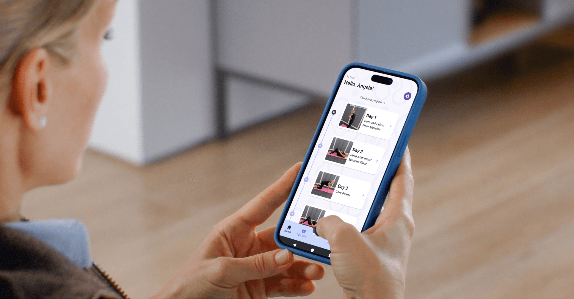
Pelvic Floor Mobile Redesign
Mobile physical therapy app that helps patients strengthen their pelvic floor
Timeline:
7 months
Tags:
Mobile / High-fidelity / Shipped
Role:
Primary designer / User researcher
Impact:
Increased sign up rate by 20%
TOOLS:
Figma, Figjam, Whimsical, Claude Design
step 1:
Context
What is Pelvic Floor Pro?
The ultimate mobile companion for strengthening and maintaining a healthy pelvic floor, Pelvic Floor Pro provides personalized plans, expert-guided exercises and progress tracking - all in one convenient place!
With a monthly or annual subscription, patients gain access to easy-to-follow exercises tailored to their needs which empowers them to take control of their health.

Our Target Users
Apps in the women's health space usually focus on pregnancy as opposed to postpartum care or pelvic floor issues, due to the stigma around it. Thus our goal was to help patients such as Lauren and Diana with pelvic floor issues, an underserviced yet important area.


Quantifying the Issues
I worked with the product owner to establish our current metrics. We looked at Revenuecat analytics to find benchmark metrics for the free trial sign-up rate and telehealth no-show rate. Patients typically signed up for free trials at a rate of 5% which we aimed to increase. We also had a no-show rate of 100% which we aimed to decrease.

Redesign Objectives
Increase 5% free trial start rate
Redesigned onboarding experience (A/B tested new paywall)
New email marketing campaign
Decrease telehealth no-show rate
Reduce the number of no-shows
Increase virtual attendance for free consults
step 2:
research
Heuristic Audit
I conducted a heuristic audit of the existing mobile experience in Figjam. After reviewing takeaways with the product owner, we decided to focus on redesigning the onboarding flow which was the most relevant for increasing our free trial start rate. We kept the other suggestions for future redesigns.

Competitive Audit
We looked at the onboarding flows of 10 other health apps and came away with inspiration for how to demonstrate provider expertise, provide incentives during onboarding and provide guidance to patients.

step 3:
increasing trial starts
Onboarding Redesign
I worked with the product owner to simplify the onboarding flow for new users. We ended up reducing the number of screens by 10 and saving 15 seconds as seen below. The main change was replacing the 20-question PFDI form with fewer screens that balanced engagement with enough information gathering to assign patients a custom plan.


Paywall A/B Test
A key moment of the onboarding process was reaching the paywall where patients would decide whether to sign-up for the free trial or exit out of the app. I redesigned the paywall screen to be more accessible with a clearer CTA at the bottom of the screen, new UX writing and a clearer "X" icon to exit out of the screen. We A/B tested the redesigned screen with the original within Revenuecat and found that the new screen scored 2x the amount of paywall sign-ups!


Email Marketing Strategy
We created an email marketing campaign with Sendgrid that triggers when the user creates an account during the onboarding flow. Our goal was to encourage the user to continue the onboarding flow and ultimately start the free trial. Based on user's responses to the onboarding questions, we would send them the appropriate email campaign (out of the 9 possible plans) that gives them free guidance on their problem area.


step 4:
decrease telehealth no-shows
Free Virtual Consultations
To help our providers gain more patients, we started offering free 15 minute virtual consults. During these visits, providers would not only help understand their patients problems but also promote the custom plan features of the Pelvic Floor Pro mobile app.
Patients who attended these free visits ended up converting 90% of the time. However, our bottleneck was getting people to show up to the free visits. We decided to change our user flow as shown below.
step 5:
final experience
Final Mobile Experience
You can view the final mobile experience below, separated into three main areas: Onboarding, Scheduling a Visit and Completing a Daily Workout
Candidates often did not sign up for the free trial because the onboarding process took too long.
To solve this issue and increase free trial starts, we created a simple onboarding flow that got patients in the door without needing to create an account first. Once they were several screens deep, they would be incentivized to create an account to save their progress. From there, they could schedule a free consult or continue on to their custom plan.
step 4:
reflection
Reflection
I thoroughly enjoyed working on this project and seeing the real-world impact on the patients, some of whom I knew personally. This was a great experience in iterating with developers and managing stakeholders, from running the calls when the product owner was away, to iterating closely with the developers who were in different time zones. Overall, I am proud to have designed for Pelvic Floor Pro and to have contributed to the health of its users.
Stakeholder Quotes:
Insert quote here
Product Owner
Pelvic Floor Pro
selected work